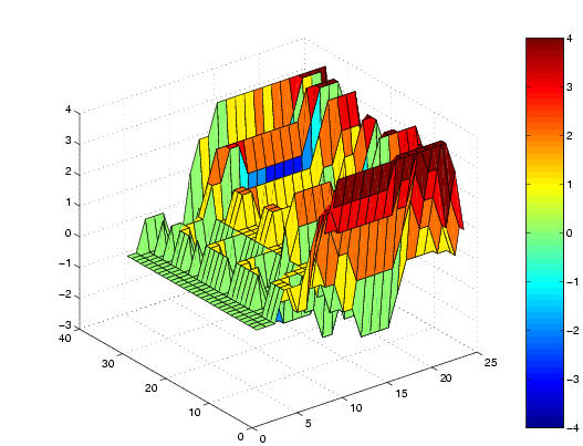
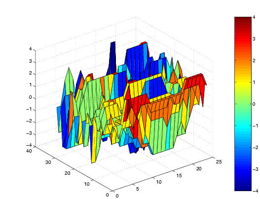
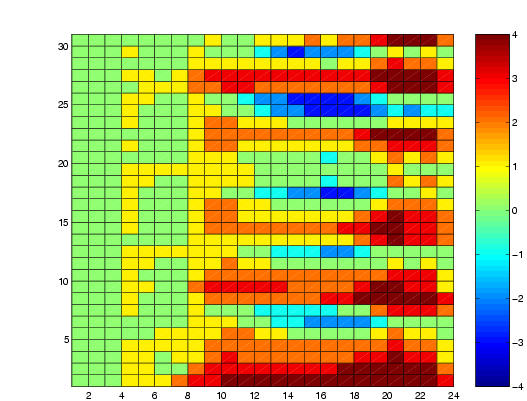
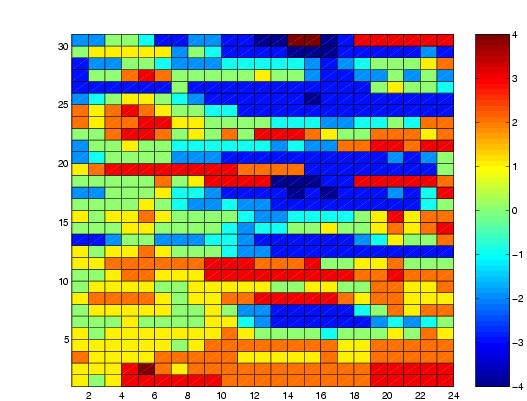
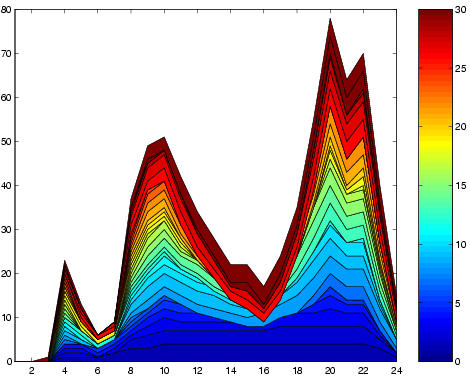
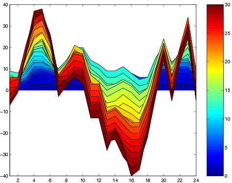
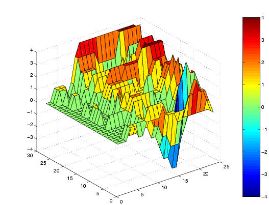
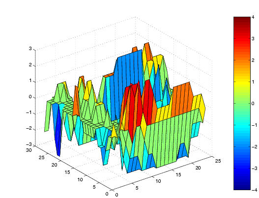
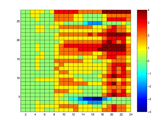
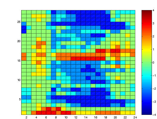
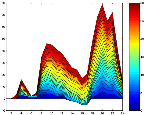
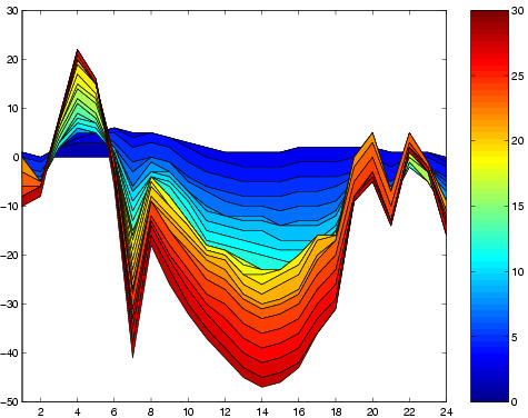
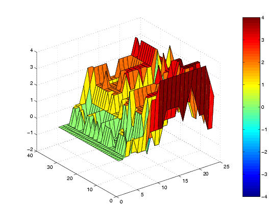
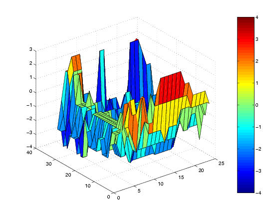
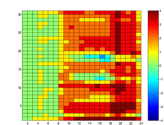
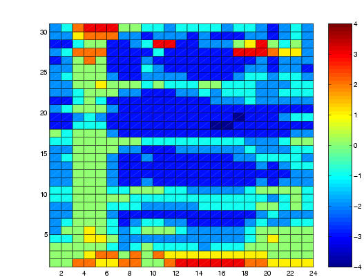
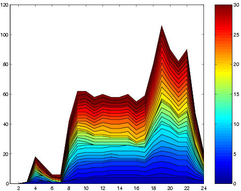
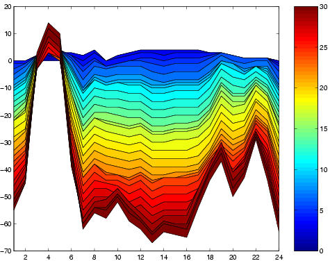
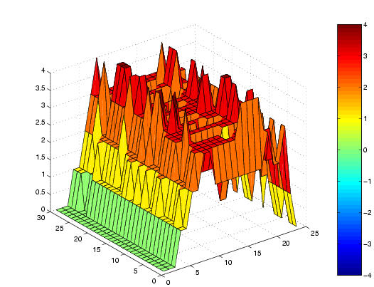
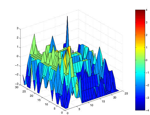
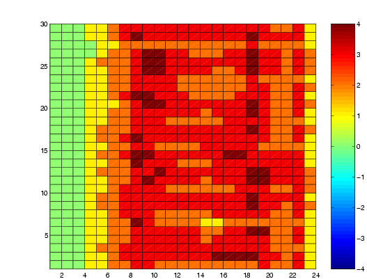
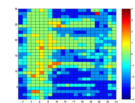
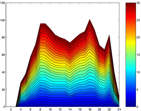
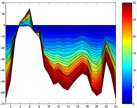
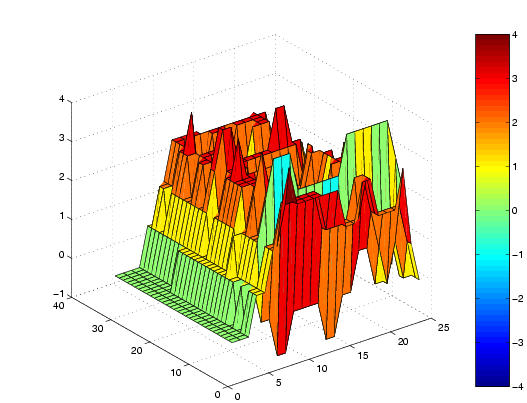
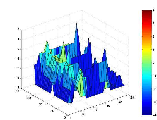
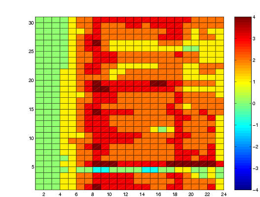
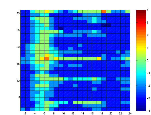
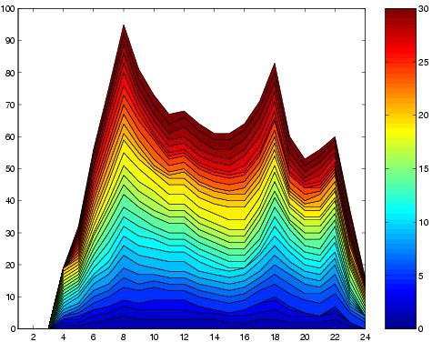
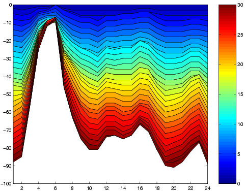
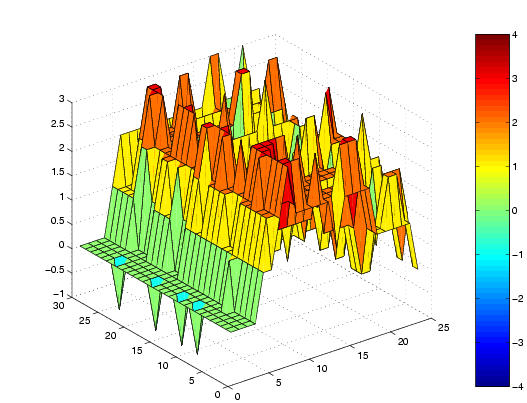
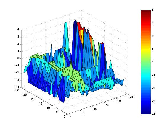
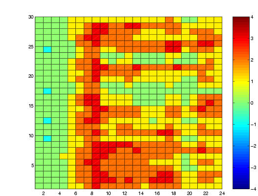
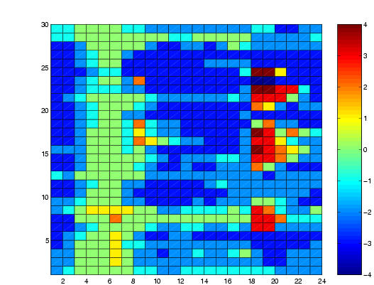
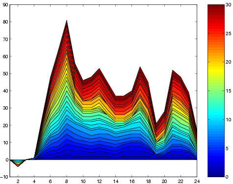
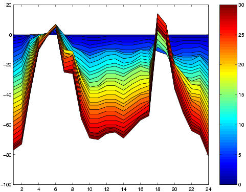
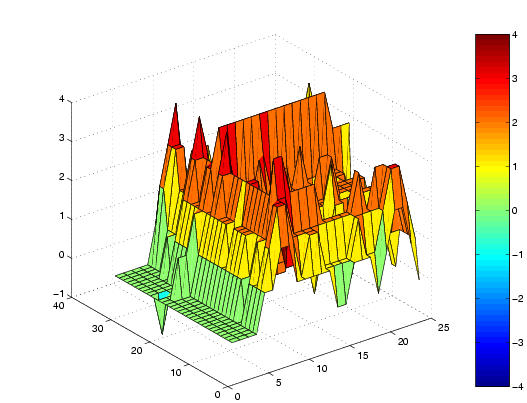
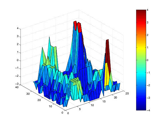
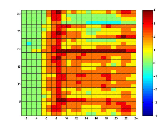
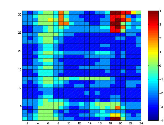
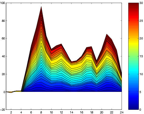
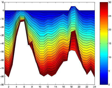
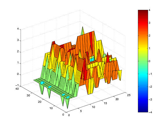
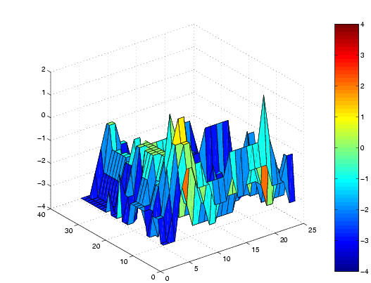
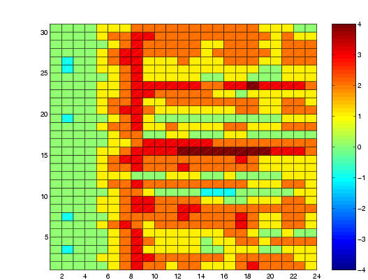
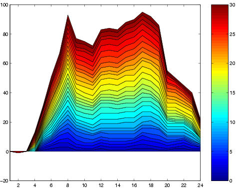
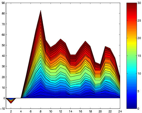
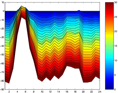
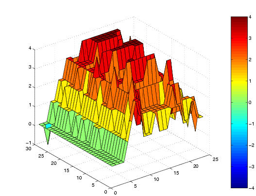
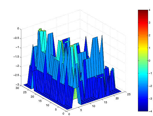
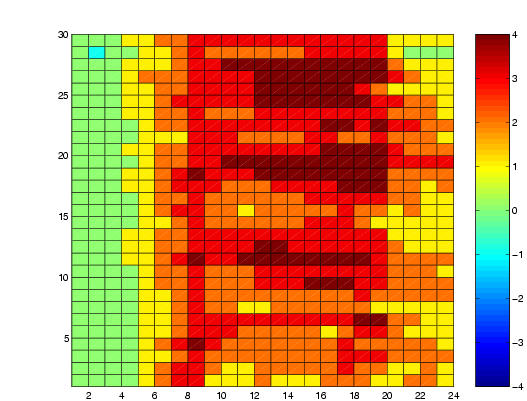
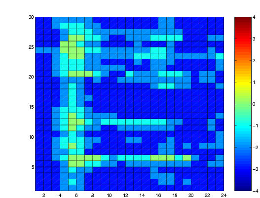
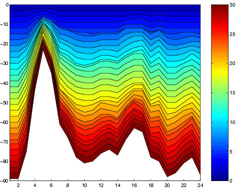
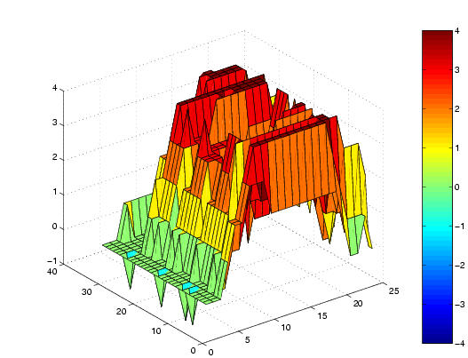
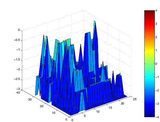
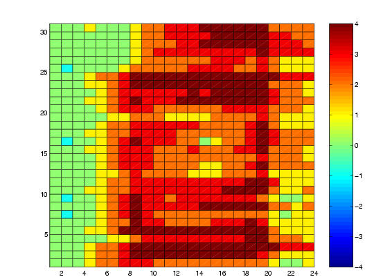
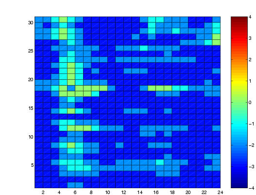
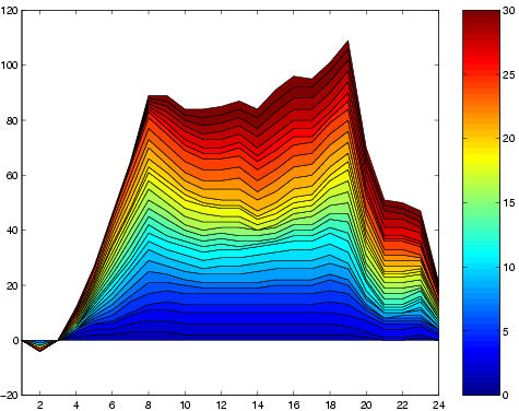
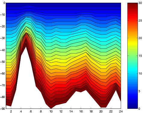
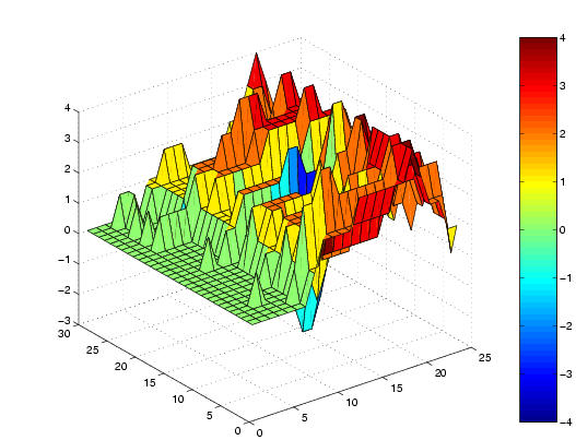
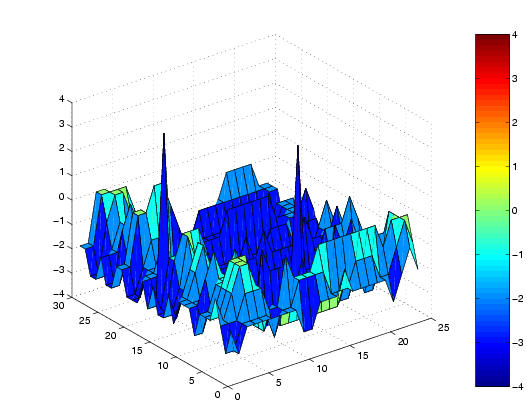
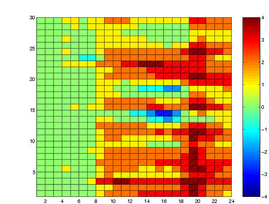
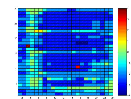
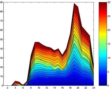
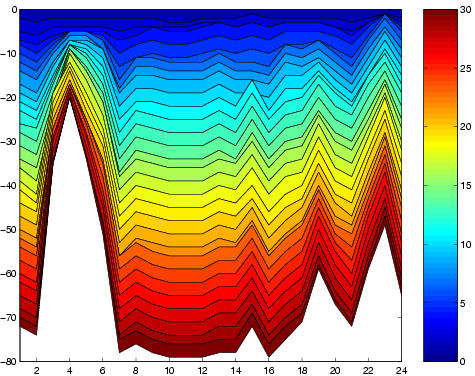
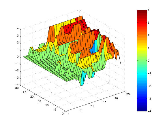
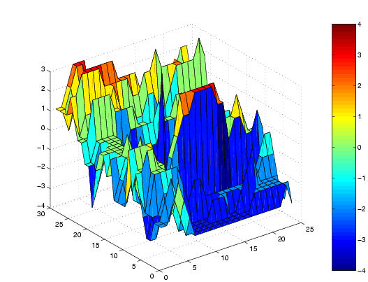
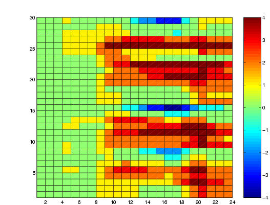
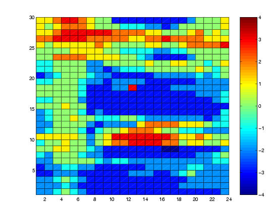
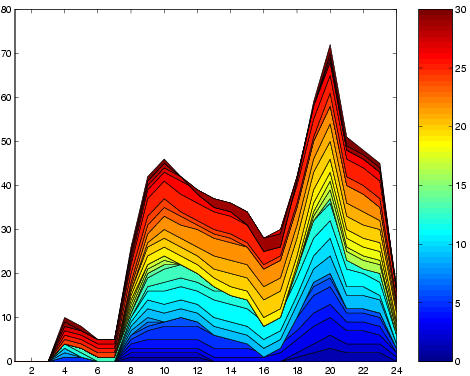
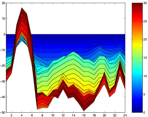
The following plots have been generated from data taken from the NEMMCO site, (http://www.nemmco.com.au/). We have used the matlab commands surf (First plot), pcolor (Second plot) and area (third plot) to visualise the difference between the Queensland Total Demand (left hand column) and the Regional Reference Price (Right hand column) and an average of these quantities for New South Wales, Victoria and South Australia. The surf plot show a 3D plot of (hour day, day of month, difference). The contour plot shows (hour of day, day of month) and the area plot shows (hour of day, sum of difference across days of the month). More details relating to preparation of data and analysis of data may be found in ???
Total Demand: January, 2003 Regional Reference Price: January, 2003
Total Demand: February, 2003 Regional Reference Price: February, 2003
Total Demand: March, 2003 Regional Reference Price: March, 2003
Total Demand: April, 2003 Regional Reference Price: April, 2003
Total Demand: May, 2003 Regional Reference Price: May, 2003
Total Demand: June, 2003 Regional Reference Price: June, 2003
Total Demand: July, 2003 Regional Reference Price: July, 2003
Total Demand: August, 2003 Regional Reference Price: August, 2003
Total Demand: September, 2003 Regional Reference Price: September, 2003
Total Demand: October, 2003 Regional Reference Price: October, 2003
Total Demand: November, 2003 Regional Reference Price: November, 2003
Total Demand: December 2003 Regional Reference Price: December, 2003